As 2025 winds down, you will probably read a lot of articles remarking how international stock indexes have outperformed US stock indexes like the S&P 500 by a significant amount this year. This hasn’t happened in a while! Yet, the following chart shows that the gap in valuations is still very wide.
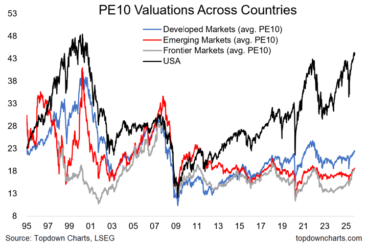
PE10 stands for the ratio of price to 10-year average trailing earnings (AKA CAPE ratio, or cyclically-adjusted P/E ratio) which attempts to smooth out earnings spikes. Image via TopDownCharts.
 The Best Credit Card Bonus Offers – 2025
 Big List of Free Stocks from Brokerage Apps
 Best Interest Rates on Cash - 2025
 Free Credit Scores x 3 + Free Credit Monitoring
 Best No Fee 0% APR Balance Transfer Offers
 Little-Known Cellular Data Plans That Can Save Big Money
 How To Haggle Your Cable or Direct TV Bill
 Big List of Free Consumer Data Reports (Credit, Rent, Work)
This gap was almost entirely driven by the US tech Magnificent 7. The broad US market strongly resembles the rest of the world. Scroll down to chart with this part:
“3. Strip out the Magnificent-7 and European companies have been almost as good at growing earnings as US ones”
https://www.firstlinks.com.au/the-case-for-and-against-us-stock-market-exceptionalism
Many people bet on Bitcoin, permanent remote work, Biden’s green programs, AI, etc. Some of this gap follows from self-feeding momentum players. We’ll learn who was ‘rational’ in a few decades. Maybe.
The U.S. market has a much higher sector weighting to technology than the other developed countries. Technology companies are asset-lite businesses with high margins and generally have higher valuations. That said, on a sector-neutral basis, the U.S. is still more expensive than international developed markets, though not nearly as much as at the headline level.