I mentioned in my 2017 asset class roundup that the S&P 500 went up every single month in 2017 and how that was the first time that had ever happened. According to the WSJ Daily Shot, the S&P 500 is actually on a 14-month positive streak. Here’s a chart showing the monthly total returns of the S&P 500 from 1990 to 2017.
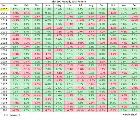
I wanted to save it for future reference, but I don’t have any good lessons from this chart. I suppose it is good to know that there are a few 10%+ drops within a month. Otherwise, I wouldn’t read too much into it.
 The Best Credit Card Bonus Offers – 2025
 Big List of Free Stocks from Brokerage Apps
 Best Interest Rates on Cash - 2025
 Free Credit Scores x 3 + Free Credit Monitoring
 Best No Fee 0% APR Balance Transfer Offers
 Little-Known Cellular Data Plans That Can Save Big Money
 How To Haggle Your Cable or Direct TV Bill
 Big List of Free Consumer Data Reports (Credit, Rent, Work)
Thanks Jonathan, I love this chart! It confirms how positive some months are and the true
essence of discipline and conviction in sticking with it!! So hard to do in a downturn!!
That is an interesting chart. Surprisingly ONLY 3 negative months in the last 2 years. Something has got to give…
– Desi Guy.
I like this chart. It shows that a down month happens one third of the time. Of the 336 months since 1990, 115 were down months. A down month will occur 34% of the time. 4 months out of any given year. Yet it gains 66% of the time. 8 months out of any given year. Why be worried about a down month…or 2 or 3!